

Is There Any Large Country Where Excess Deaths Are Below Average?
Checking Back With Our World in Data

Once upon a time, in my graduate school studies on demographic trends, I spent a lot of time acquainting myself with birth and death charts. When the Covid pandemic rolled around I was quickly able to determine that the jabs were killing people based on the simple spikes in cumulative excess mortality. Not every country had a spike in deaths in Covid year 2020 and many especially in Asia were actually negative mortality in the first pandemic year. I have a sense that this had to do with those countries having medical systems in place with staff who were not as willing or able to roll out death protocols on their patients. Instead in those countries leaders were veritably allowed to do a victory lap in the first pandemic year for how much their strict mitigation measures including near universal mask use and insanely strict quarantine procedures for travel had “saved” their populations.
That changed almost everywhere that kept data once the Covid vaccines were rolled out and widely implemented. Sometimes there was a small lag but in country after country excess mortality shot up following the jabs. This insanely led to even stricter rules and this idea that nobody was safe until everyone was jabbed, even though any logical look at the data would lead one to conclude the exact opposite: that the so called vaccines were a catastrophic public health failure that were killing a lot of people and causing more Covid.
So has the great die off stopped? Based on what’s left of the Our World in Data website used so widely during the Covid debacle, the answer is no. This is excess mortality in a subset of Western countries through the end of 2022. I decided to look up the 2023 data which I could easily find.
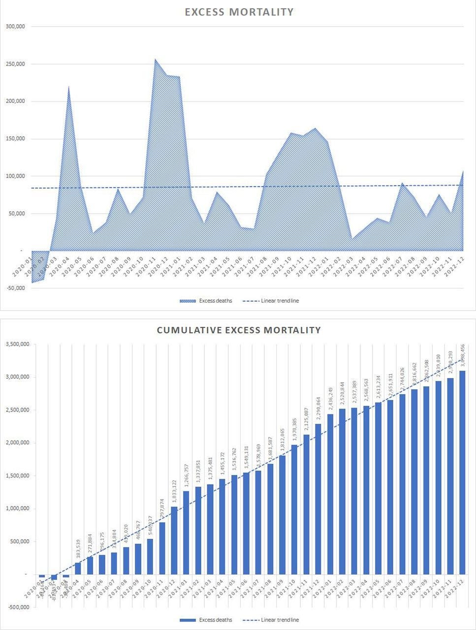
Normally after a pandemic all of the old and sick would have died off and you would see cumulative excess mortality drop below zero for a time. Now Our World in Data was not used everywhere. India and China don’t even exist on the cumulative excess drop box as is true of multiple less jabbed African countries. Some countries stopped collecting the data in say 2022 or even at the end of 2021. But I decided to tease out what I could from the data before it disappears altogether.
I had a bunch of countries where I literally just grabbed three in a row in alphabetical order and had stuff that looked like this. The near flatline for Transnistria (??? is that a country?) is due only to its extremely small population relative to say Turkey (I’m grabbing total death numbers here not percentage of population ones). Note how some countries were below zero excess in 2020. Did Turkey stop carrying data when the name changed? Sometimes you can almost see the yeah we might have killed some people cutoff points…

Some smaller countries like Bhutan look okay except for that recent spike and data cutoff point in 2022. Normal cumulative excess mortality should trend around zero and this 2020-2022 chart would not have alarmed me at all in my graduate school days. I had an extremely difficult time finding things that looked like this now.

Australia kept data through late 2023. It doesn’t look good in the land down under. Where in that late 2021 early 2022 area had the almost fully vaccinated population been saved from the scourge of Covid?


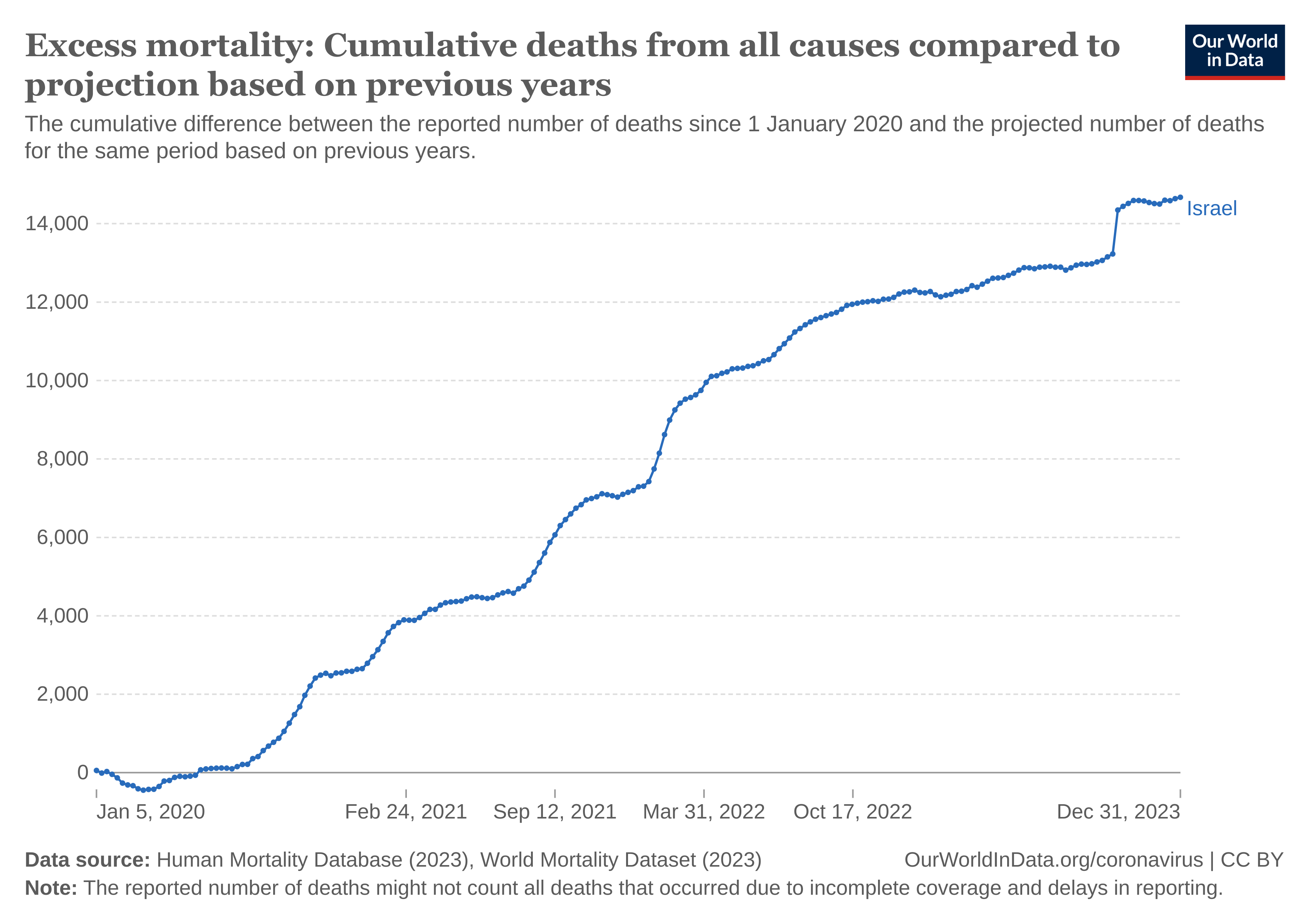
I noticed the October 7 2023 spike was actually preceded by a few larger excess death jumps in Israel. I’m just saying…
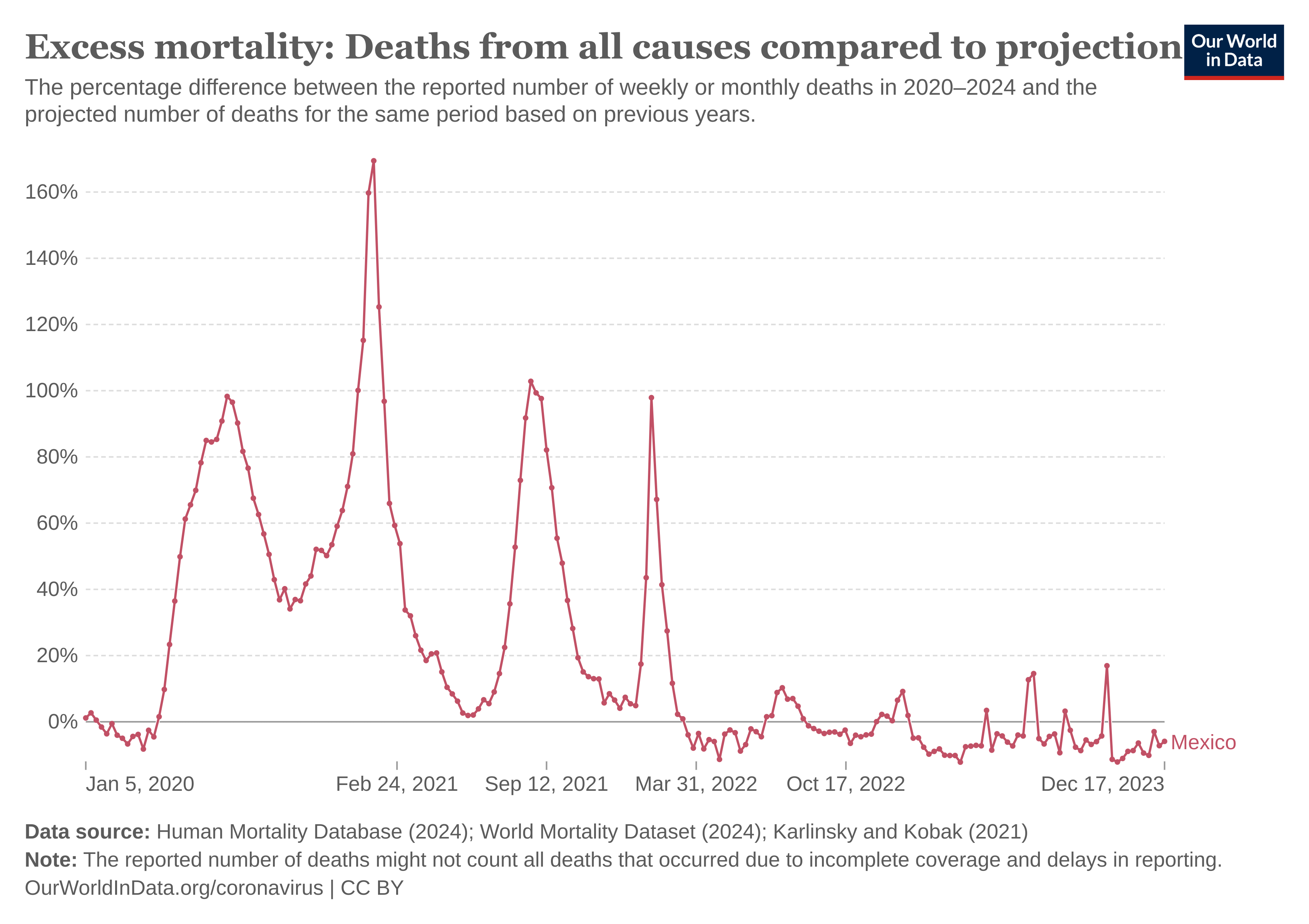
Here’s some larger countries grabbed at random.

Mexico however is now trending down at least on a percentage basis…
Somewhat obviously the already dead don’t come back to life, but in a normal environment those dying are primarily old and sick so their death means one less person dying in subsequent years. That link seems to have been fundamentally broken. This looks like a war footing and one against humanity which is still ongoing.
Add up all of the excess deaths on these charts alone. Of course the limited hangout is that it was Covid and they did the best they could! As highlighted in this article let’s look at just so called Covid deaths in strict lockdown New Zealand:
New Zealand: a Lesson in Lockdown Failure
One need only look at the data from New Zealand in the following chart to know that social distancing and locking down entire populations does not prevent the spread of respiratory viruses.
")
As pointed out by former United Nations Assistant Secretary-General Ramesh Thakur, 99.3% of Covid deaths in New Zealand occurred after 60% of the population was fully vaccinated. In Australia, another hard lockdown country, that figure was 93%. In other words, harsh lockdowns can delay the spread of a respiratory virus, but not prevent it. Meanwhile, the lockdowns cause economic mayhem, and social and emotional devastation, and inflict permanent disadvantages on the upcoming generation. Lockdowns are a violation of fundamental human rights and should never be tolerated again as a viable means of containing viral spread, not even if a perfect vaccine antidote can be manufactured in less than 100 days.
The above, and similar charts for other states and countries, was created by Ian Miller from official publicly available data. It’s mystifying that anyone can actually look at these charts and claim, “Yes, but Covid-19 would have been so much worse if we hadn’t masked, locked down, and taken the vaccine.” How can there be worse results than exponential growth in cases; increased illness, hospitalizations, and deaths in the vaccinated; increased Covid deaths after vaccination, and a marked rise in excess deaths – especially among the young?
Mistakes were made my arse. They want to do it all over again. Until everybody dies apparently nobody is safe…
We were really enjoying the live music in Laos at this restaurant on the Mekong river. It was evocative, soulful and melancholy but I’ll take it far over some pretentious Anthony Blinken crap about Rocking in the Free World in Kiev (I guess the bar and restaurant scene has expanded there alongside the corruption and money laundering and pointless deaths especially of military aged men). What if we all were the chosen ones?
Wishing you all a blessed day…
Iceland had about the same population as Placer County in California where I live, and when the lockdown started I was looking at that. This morning Placer County population has increased retroactively. Both were around 360K.
How will they hide the excess death data in small countries? I keep thinking that maybe the world population data has been skewed and inflated for decades in preparation for this.
I'm reminded of the meme you posted reflecting that 85% of the population believe human stupidity will bring about the end of the world.
We are on track...