

Could the Number of People on Earth Already Be in Decline?
Rounding Out the Numbers

A recent article in theCovidBlog entitled “5 Reasons to Believe the Global Population is Already 1 Billion Less People than January 2020” caught my attention. Author Brian Wilkins tends to be on the pessimistic side of things, but with country by country showing increased deaths and decreased births since the jab rollout, could it be that the population is already going down?
According to the article Worldometer claims the global population eclipsed 8 billion in 2022 and that thus far in 2023 approximately 40 million babies have been born whereas 20 million people have died. Of course if Covid taught us anything it is that those think tanks are all too willing to fudge the numbers. Calculating global births and deaths requires some extrapolation, assumptions and interpretation. The powers that be meanwhile have been on board with a “there’s too many humans” mindset for the better part of centuries. In short, they could be lying to cool the marks, especially if a global population decline was happening right in front of our eyes.
Now both Las Vegas and Phuket in 2023 have looked pretty on par with what I saw in 2019 or so in the area. The roads around my house in Las Vegas even seemed more crowded than before, but Sin City has been picking up people steadily and was the ninth fastest growing metropolitan area in the United States. I don’t doubt this because the area seems more crowded and the roads more congested. This doesn’t mean that the world population is increasing, however. Visitors to Las Vegas through March 2023 were still down 1.1% on 2019 levels, even though conference attendance was up 39.6%. Thailand saw 8.5 million visitors in the first four months of 2023, down perhaps 40% on 2019 levels.
So where did the new Las Vegas residents come from? Here’s a list of the fastest shrinking cities in the USA from 2020-2021:
What are the top ten cities on decline?
Cities With the Biggest Pandemic Population Loss
New York City. 2020-21 population loss: -305,465. ...
San Francisco. 2020-21 population loss: -54,813. ...
Chicago. 2020-21 population loss: -45,175.
Los Angeles. 2020-21 population loss: -40,537.
San Jose, Calif. 2020-21 population loss: -27,419. ...
Philadelphia. ...
Washington, D.C. ...
Boston.
Now some of the data on population on the US Census Bureau website is difficult to use to get a big picture of population growth or decline. The reason for that is because growth and declines are listed in percentage terms by county, even though a US county can vary in population size from less than 100 people to almost 10 million (That’s Los Angeles county, the largest).
I found this chart of US housing stock interesting:

Most parts of the USA have had a large increase in housing stock. This is through July of 2022 a little after the Federal Reserve started raising interest rates, though I don’t think home sales had really slowed down over this yet. Another reason for an increase in housing stocks is more homeowners than usual dying, say, or perhaps no longer being able to live independently at home due to health issues.
I saw a Bitchute video from a mail carrier dated May 27, 2023 who says that she has had 19 people die on her route in the past four months! It could be a one off thing, but it is scary to contemplate: she compares the size of her route (a little over 1000 people) and the number of people who died in a given year usually (1-2). Postal carriers are in a great position to see large die offs if they’ve been on the same route for many years as they would see the death notifications. Perhaps that is something Steve Kirsch should sample.
There is no US birth data for 2022 from the CDC, even though this report usually comes out in late April or early May of the next year. So birth estimates are given which are just that: estimates. Could they be hiding this data?
According to this Global Research article 600,000 Americans are dying from the Covid jabs every year:
Those vaccinated against COVID-19 have a 26 percent higher mortality rate on average compared to those who declined the jab – and the death toll is even more staggering for vaccinated people under 50 years old, where mortality is 49 percent higher than for those unvaccinated.
The shocking numbers are based on government data from the United Kingdom and were brought to Senator Ron Johnson’s (R-WI) attention by Josh Stirling, one of the nation’s top insurance analysts and formerly Senior Research Analyst for U.S. nonlife insurance at Sanford C. Bernstein & Co.
“Worst of all – the people who only took one dose of the vaccine have an approximately 145 percent worse mortality rate,” Stirling said and explained that this even higher death rate applies to those who took the first shot and then had adverse reactions, making them stop the planned vaccination schedule.

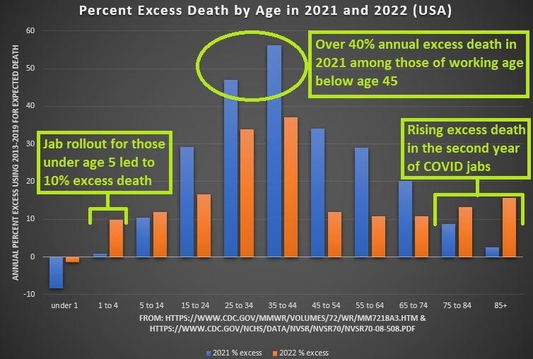
A Deep Dive broke down excess death figures in the USA by age:

While those of middle-age experienced the most excess death in 2021 — likely linked to the fact that the average age of a COVID jab recipient was 54 — in 2022, it is the very young and the very old who are experiencing the biggest increases in excess deaths (blue = 2021; orange = 2022):
Surely the population is growing due to all of those births, right? Actually it’s been shrinking for a long time in most countries. The shortfall is just made up by immigration:

According to Kyle Young:
The ongoing official narrative from the legacy media is that the worlds population is rising above sustainable levels and that this overcrowding will lead to ever more pandemics, famines, mass migrations, starvation and terrible chaos. I’m not arguing the possibility of those things coming to pass, but I am saying they will not happen because of overpopulation. As has been the case throughout modern history, those things happen because of manipulation of events by the controlling elite.
But I’m also saying the population will collapse because of similar, but more esoteric machinations.
The official apocalyptic scenario that we’ve been hearing for decades is a very well planned and implemented world-wide psyop to cover up the real agenda. The reason the apocalyptic overpopulation scenario is aired is because it’s highly profitable for the makers of the products which are currently being used to carry out that agenda; the military industrial complex, disease causing bioweapons made by the pharmaceutical industry and passed off as medicine, insurance companies that cover the costs for elites when things go wrong, jingoistic mass media companies that instill fear in everyone about fake diseases and the ‘unfolding apocalypse’, and energy companies that supply the energy needed to run all of those operations. Of course none of this would be possible without the management of these events by fascist governments that shepherd the media and the masses in the desired direction by running the propaganda aspect of the operation on behalf of the elites running the show.
I find this birth gap to be a brilliant way to understand the problem as explained here:
To maintain a population, on average every women needs to have at least two children. In reality, that’s never been the case. Some women have none, some have just one and some have 5 or more. Because earths human population has been growing for centuries we know the average number of births per woman has long been higher than two.
In many countries right now the per woman average is well below two.
Even when that number falls below two, the population will not begin to decline immediately and in fact, can continue to grow. Several generations need to pass before the effects begin to show up. During that interim period of 50 years or so the difference will be imperceptible - unless the underlying statistics are scrutinized. We are now in that interim period.
I became aware of all of this from a website called birthgap.org, a project of Stephen J. Shaw. Shaw has compiled a lot of interesting statistics, all of which can be corroborated from other sources like the CDC, as well as similar agencies around the world and sources like Statista.
Shaw determines the birth gap by comparing the number of 50 year olds to the number of new births. Age 50 is used because that’s the generally accepted age limit for women to give birth. If the number of newborns falls below the number of 50 year olds then birth gap has been reached. A bigger version of the map below can be seen here.

Black designates areas where the population is already in decline.
This is a brilliant way to understand birth trends that I had never seen before. My hat is off to Mr. Shaw for coming up with this. The normally recognized replacement fertility rate is 2.1 children per woman, the 0.1 accounting for children who sadly pass away before adulthood. The replacement level can go much higher than that, in war torn regions with very high infant mortality, say, but in theory cannot drop below 2. This brings me to an interesting caveat of this data: what percentage of babies born make it to their 50th birthday? The number is not 100%. Every young death pulls the number forward of how many births are needed for replacement level in the remaining population. A child who dies of SIDS at 1 year old will obviously never produce babies, and it is unlikely that a 21 year old who dies in a car accident will have as many or more of them. I suppose a 47 year old who sadly passes of ovarian cancer was probably done having kids already, but you get the idea. If accounting for infant mortality and the deaths of young people, these charts would be even worse than they look now.
Kyle Young weighs in on the international scene:
overseas
Things are not looking good for South Korea. It has the highest birth rate gap in the world at 71%. Look for South Korea to soon throw its doors open to immigration to keep industry and its economy going. Italy comes in at 56%, Spain and Japan are at 55%. Germany has large gap of 35%, Canada is 27%, Russia 26%. Germany is already accepting many new immigrants.
Conversely, most sub-Saharan African countries are still on the plus side. This is the only region of the world not in decline.
So is the population of the planet already in decline? What do you think? What are you seeing in your area? And if so, what are you planning on doing about it?
apparently we ain’t seen nothin yet…
https://lionessofjudah.substack.com/p/the-deagel-report-is-coming-closer?publication_id=581065&isFreemail=true
🙀
143,233% increase in cancer.
If that is accurate, it is a death knell for humanity.